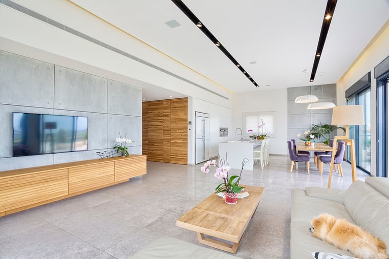
Avoid These Common Decorating Mistakes to Create a Stylish and Inviting Space


Whether you've just moved into a new home or you've lived there for years, intentional decorating will not only help you create a space you enjoy spending time in, but you'll have an inviting spot for entertaining friends and family members as well. Here are a few of the most common decorating mistakes and the steps you can take to avoid or correct them:
1. Too Many Dark Colors
Dark colors are increasingly popular with many homeowners, and for good reason. A dark hue instantly gives a sleek, elegant look to any room. However, if you use dark colors excessively, they can make a room feel small and closed in.
Make sure you balance dark decor with lighter-colored pieces. For example, if you decide you want to paint your walls navy blue or dark gray, add lighter-colored drapes, throw pillows and flooring to act as contrast to the dark paint.
Proper lighting is another way to open up a room. Large windows add dimension and allow for ample natural light. Install light-colored window shades to contrast the dark walls, which also allow you to adjust the natural light in the room to suit the mood. These shades block the sun and UV rays, which reduces the heat in your home and keeps your furniture and décor from fading. Schedule a free, in-home consultation by calling 702-260-6110 and see all of our color, fabric, style, and pattern options.
2. Crowded Tabletops and Shelves
Your tabletops and shelves are a terrific spot to show off your favorite photographs, books or decorative pieces. However, you don't want to go overboard, or these surfaces will appear cluttered and messy.
Remove items from your shelves or tabletops that you don't absolutely love. Then, arrange the remaining items in a way that draws attention to each piece. You might group like items together, or add dimension by using books laid horizontally to act as mini shelves for other pieces. Avoid putting items in a straight line; instead, play with different arrangements and heights to mix up your displays and add visual interest.
3. Artwork Hung Too High or Too Low
Pictures and artwork help make a room feel homier. They should be hung at the correct height to ensure they have maximum impact. You want the focal points of items hanging on your walls to be about eye-level for the average person.
If the artwork or pictures will be primarily viewed from a sitting position, this will affect how high you hang them. Make sure you examine prospective heights from the seats where they will be viewed to ensure they aren't too high or too low.
If you enjoyed this article, check out these blog posts for more interior design tips:

