4 Common Decorating Mistakes and How to Fix Them

 You didn't intend to make them, but there they are, for everyone to see: the design mistakes you've made because you got carried away with what was fundamentally a good idea. Fortunately, four common design mistakes don't have to be permanent. If you're stuck for ideas, this condition is fixable, too, with the following:
Design mistake No. 1: Shelves that look stuffed
Fix it by removing all the items from the shelves, placing them on the floor and starting over. You may hate to do it, but assume your eyes have been “trained” to see these items a certain way; now you're going to see them a new way. Create groupings that are meaningful to you. Consider items similar in nature (books), similar in timeline (family baby pictures), similar in theme (vacation mementos), similar in shape (vases or bowls) or similar in color. You may loathe to throw anything away, but seeing these more distinctive groups take shape on the floor around you may prompt you to put the out of place items elsewhere in your home.
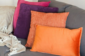
Design mistake No. 2: Out-of-control pillow heaps
Fix it by devising a rotation system, changing pillows on your chairs, sofas and beds with the season. In this way, you won't have to throw any pillows away, and you'll probably derive greater enjoyment – and use –the visible ones . Limiting pillows to three on a bed, two at the end of a sofa and one on a chair will contribute to a sharper, streamlined look.
Design mistake No. 3: Dark walls that look depressing, not moody
Fix it by adding lighting or introducing new colors into the palette. Position uplights so the ceiling doesn't disappear and ambient lights and downlights to bring out the undertones in dark colors. Lighting can add drama and elegance to rooms with dark paint, but if it's not enough, introduce complementary colors. If you don't want to repaint a wall, consider hanging a large piece of artwork whose dominant color is dusty pink, silver-gray, mint, light mustard or teal. Metallic accent pieces will bolster both fixes, too.
Design mistake No. 4: A comfortable room that looks lifeless
Fix it by anchoring the room with a focal point – an oversized piece of furniture (an antique secretary), a whimsical piece (a vintage radio or turntable), a textured rug or a wall of photographs. Many homeowners anchor a room around a natural attention-getter: the TV. If you've done this, too, deliberately arrange the other half of the room around a new focal point to give the room visual interest.
Contact Polar Shades
There isn't a design mistake in any room of your home that couldn't benefit from an infusion of style from interior window shades from Polar Shades. Whether it's more light, less light or a complete blackout from light you prefer, Polar Shades has the shade that will meet your goals – and exceed your expectations. Call us at 702-260-6100 and make an appointment for a free in-home consultation and know that unlike those common design mistakes, Polar Shades are something you'll want everyone to see.

